

For me, building a great visual system is like making a timeless music album. Every individual sound is intentional and every track has to fit. Each visual project I take on is an opportunity to explore how far I can push an idea within context. This is my track.
When I joined Cowrywise in 2021, one of the first things we did was update our outline icons to create visual harmony across our icon set. We had two distinct styles: one with chiselled corners and the other with rounded corners.
After carefully auditing the icons, we settled on the one that worked best within our visual system and re-illustrated all our outline icons. To make sure we could reproduce icons consistently, we did what designers do: we created a grid system.
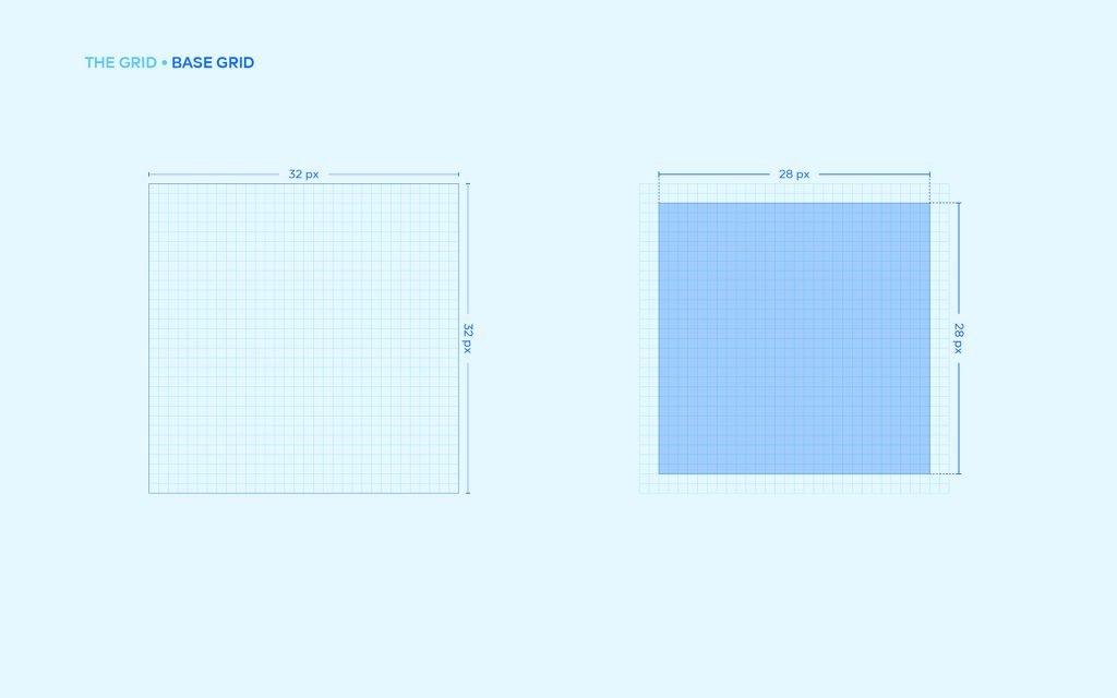


The 32×32 grid caters for the general outline of objects—square, rectangle, and circle. With this system, we’ve had different designers illustrate icons that fit seamlessly with little-to-no supervision.

Outside this grid system, we also created some three-dimensional product icons for our website.
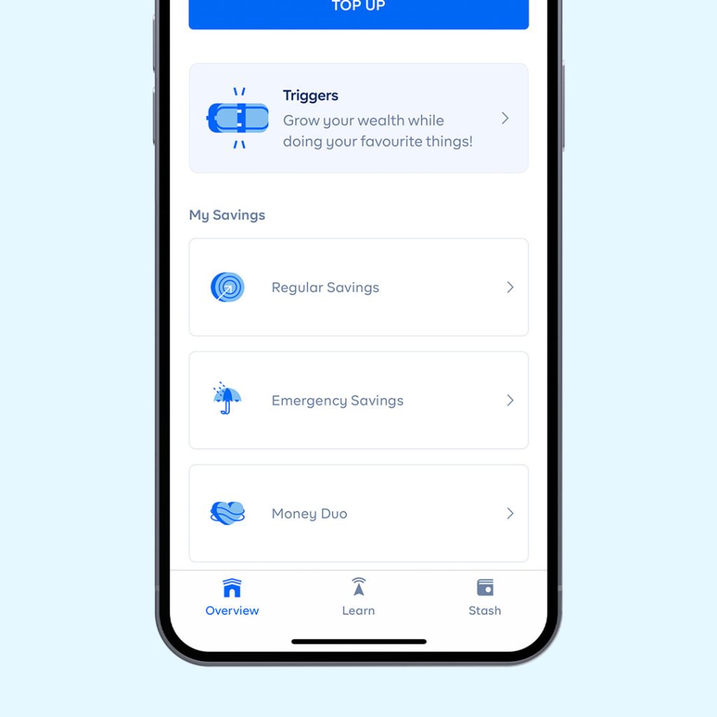
Fast-forward to 2023. I was playing around, fiddling with a new icon style. I came across this (2.5D) illustration (which, I believe, inspired my final output).I remembered that the reason our illustrations are three-dimensional is because we see money from all sides. I wanted to stick to this idea, but I still had something else to consider — I needed them for our in-app product icons, so they had to be legible in relatively small sizes.

After playing around with the style a little bit, trying to balance both goals…


…we created a pretty distinct look for our in-app product icons, creating an icon style inspired by our visual system, which is centred around money.

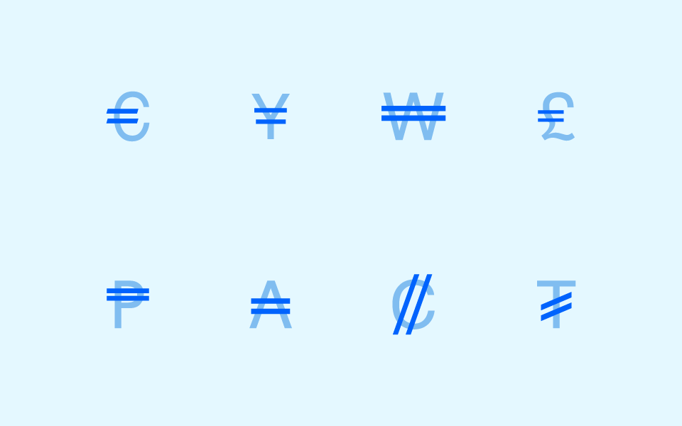
We used the one consistent thing in most currency symbols: the strikethrough. Every currency symbol we examined had either one or two strikethroughs. For the reference to be more relatable, we used two strikethroughs, just like the Naira symbol.

We also updated our navigation icons.
Next article


Chima Ataman;
{ Team Lead Infrastructure } Cowrywise