September 19th, 2024

{ Engineering }
Design systems in Frontend Engineering.

Chinonso Anagbogu
Scaling a product brings with it a host of challenges, and as our product and teams grow, we must ensure that our customers have a unified experience across all our products and touchpoints. Using systems ensures that we have a consistent experience across our products.
Our main web dashboard offers products like Mutual Funds, Money Duo, Stash, and Managed Portfolio. We also have standalone dashboards like Embed and Sprout, with different teams handling them and their features. Our design system ensures consistency across all dashboards and products, no matter which team is working on them.
In this article, we’ll explore the anatomy of our design system and how it helps in product development.
Layers that make up our Design System
There are 4 different layers that make up our Design System;
- Foundations
- Tokens
- Core Systems
- Components
Foundations Layer
This is the bedrock of our design system, defining the core visual and interaction principles of our digital products. This layer includes the foundational aspects of our brand identity, such as colours, typography, spacing, etc.
For instance, we establish our primary and secondary colour palettes here, along with guidelines on how to use them in different contexts. We also define the typography hierarchy, ensuring that font sizes, weights, and styles are consistent across all interfaces. The same applies to spacing, where margin and padding rules help create a cohesive and balanced layout.
Tokens Layer
This layer of our design system encapsulates key design decisions by codifying them as tokens or variables. These tokens are tied to the foundational elements, allowing us to associate specific names with core design properties like colours and breakpoints. By storing these design decisions in variables, we maintain consistency across all platforms and ensure that any changes made in the system are automatically applied throughout the application.
For instance, tokens like $ colour-primary and $ colour-secondary below define our primary and secondary colours. Every time we use these colours in any component, they reference these variables, ensuring uniformity and making it easy to propagate updates across the system.
Example:
// _variables.scss

$color-primary: #0066f5;

$color-secondary: #0a2e65;

$breakpoint-med: 1024px;

$breakpoint-small: 600px;
Core Systems Layer
This layer forms the backbone of our UI implementation, providing a set of pre-defined building blocks that address common interface challenges. It is crucial in managing the core aspects of the UI, such as layout, responsiveness, theming, animations, etc., ensuring that these elements behave consistently across all products. For example, we use a responsive layout mixin to adapt our interface seamlessly across different screen sizes, from mobile to desktop. This reduces the need to write custom media queries for each screen size and ensures our designs are consistent across devices.
// _mixins.scss

@mixin screen($size, $type: max, $pixels: 600) {

  @if $size== 'small' {

    @media screen and (max-width: $breakpoint-small) {

      @content;

    }

  }@else if $size== 'mid' {

    @media screen and (min-width: $breakpoint-small) and (max-width: $breakpoint-med) {

      @content;

    }

  } @else if $size== 'large' {

    @media screen and (min-width: $breakpoint-med) {

      @content;

    }

  }

}
Here, we define breakpoints for small, mid, and large viewports using established tokens like $breakpoint-small and $breakpoint-med, making it possible to manage layout changes and responsiveness efficiently.
Components Layer
The Components Layer is where we define and access the reusable building blocks of our interfaces. These components range from simple elements like buttons and inputs to more complex structures like headers, forms, and navigation menus.
The components are built on top of the foundational layers of the design system, including tokens, core systems, and foundational design principles, ensuring consistency and scalability across our entire product range.
The Components Layer is central to building and scaling our digital products. By leveraging reusable elements, we streamline development and ensure that any updates to styles or behaviours are propagated across all component instances. This boosts both efficiency and flexibility, enabling the team to focus on delivering high-quality customer experiences without having to recreate basic elements from scratch each time.
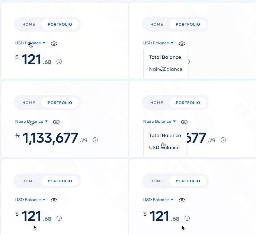
An example is the component we use to display customers’ balances within the main web dashboard. This BalanceView component is used across multiple products, ensuring customers experience a consistent and reliable interface when viewing their balances across the board.
// BalanceView.vue

<template>

  <div class="balance-view">

    <div class="balance-view__inner">

      <div class="balance-view__hidden" :class="{ active: balanceHidden }">

        <BalanceHidden />

      </div>

      <div :class="{ active: !balanceHidden }">

        <div class="balance-view__amount">

          <h2>

            <sup>{{ symbol }}</sup>

            {{ balanceAmount | formatAmountWithoutDecimal }}

            <sub>{{ balanceAmount | formatAmountOnlyDecimal }}</sub>

          </h2>

          <button v-if="showInfo" @click="$emit('onViewTotalInvestment')" class="button unset m-l-25 balance-view__info">

            <template v-if="$slots['infoIcon']">

              <slot name="infoIcon"></slot>

            </template>

            <img v-else svg-inline src="~/assets/svg/icons/about-info.svg" />

          </button>

        </div>

      </div>

    </div>

    <BalanceToggle v-if="showToggle" />

  </div>

</template>

<script>

export default {

  props: {

    balanceAmount: {

      type: Number,

      required: true

    },

     symbol: {
      type: String,
      required: true
    },
    showToggle: {
      type: Boolean,
      default: true
    },
    showInfo: {
      type: Boolean
    }
  },
  data() {
    return {
      balanceHidden: false
    }
  },
}
</script>
This Vue component, BalanceView, is a reusable component that handles how customers view their account balances. It receives props like balanceAmount and symbol, which dictate the displayed balance and currency symbol. It also supports additional functionalities like toggling between hidden and visible balance states and showing extra info through buttons or icons.
It draws from the foundational tokens (like colours and spacing) and core systems (like media queries for responsiveness), allowing us to integrate it seamlessly across various parts of the app, ensuring a unified and consistent experience for all customers.
Implementing a design system has been instrumental in maintaining consistency and efficiency across all our products. By providing a centralized set of design tokens, components, and patterns, we’ve embedded our brand identity directly into our codebase, allowing teams to collaborate seamlessly and develop faster. This system has reduced gaps between design and development, eliminated redundancy, and empowered us to deliver cohesive, customer-focused experiences across different products, enabling us to bring features to market confidently.
Next article


Chima Ataman;
{ Team Lead Infrastructure } Cowrywise